FIFTY BROOK GREEN
Crafted by
the Tide.
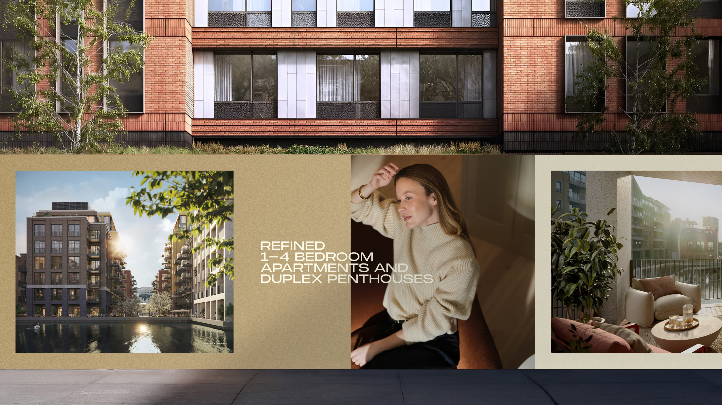
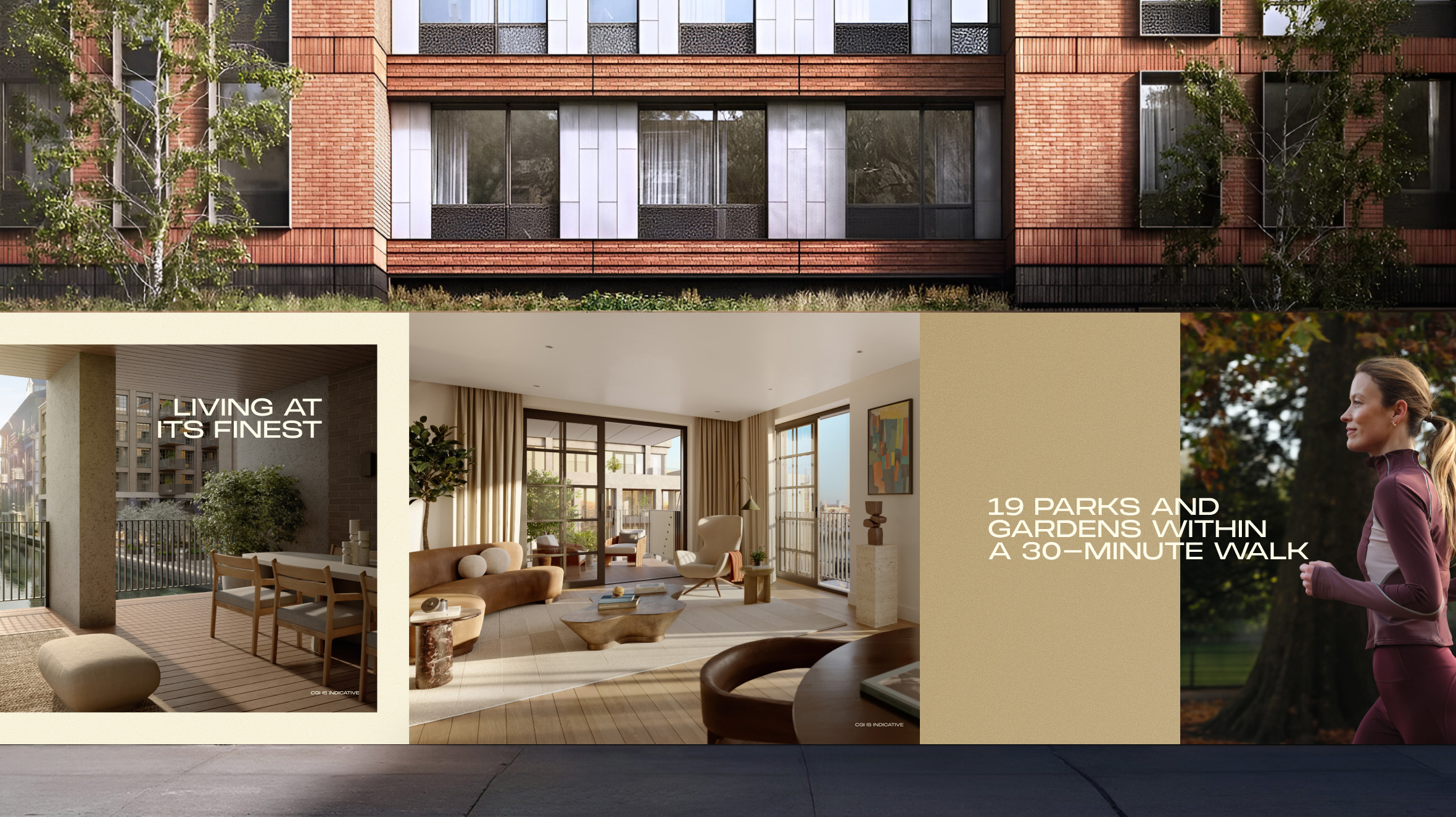
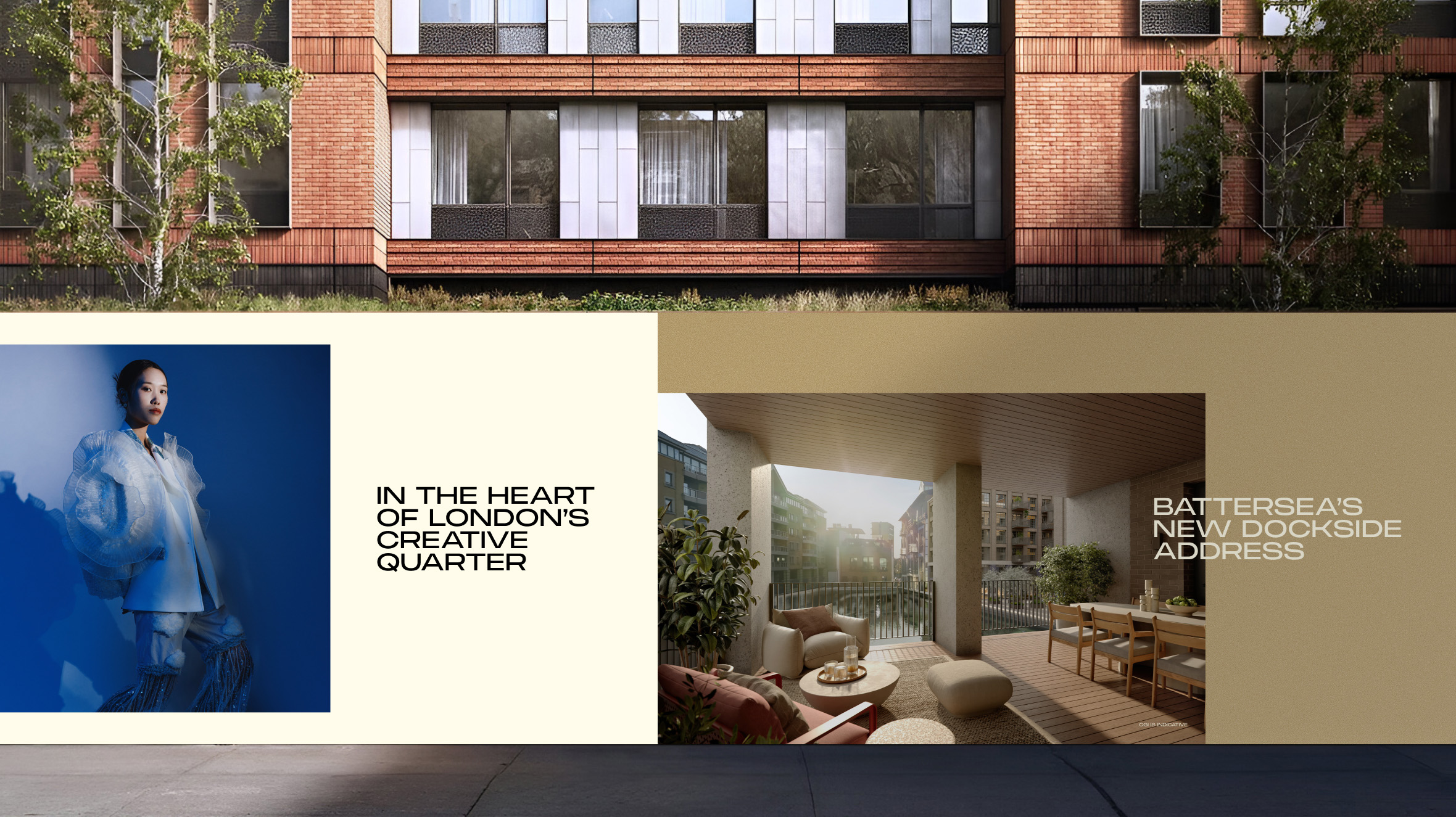
Ransome’s Wharf is a waterfront residential development positioned between Battersea and Chelsea, set within its own historic dock along the Thames. Located at the heart of London’s creative quarter, the project called for a visual identity that could reflect both its heritage setting and contemporary ambition.
The branding draws from the geometry of the dock and the movement of the river, shaping a refined identity system for a collection of 1–4 bedroom apartments and duplex penthouses within a curated enclave of dining, wellness and workspaces.
Creative & Design Director: Adi Constantin
Designers/Creatives:
Adi Constantin, Gus Cheung, Carlos Canovas, Natalie Vosloo
Copywriters: Rachel Jarvis, Nat Sequeira, Laura Hunter
Project Manager: Nick Bennett
Client Services: Nick Bennet, Naomi James
Photographer: Raluca Margescu
Production: M.


The Inspiration.
The visual identity for Ransome’s Wharf draws directly from the character and setting of the development itself. Inspired by its unique position within a historic dock along the River Thames, the design language echoes the geometry and flow of the waterfront landscape.
This influence is most clearly expressed in the custom “R” monogram, which was carefully shaped to mirror the distinctive form of the dock. The result is a mark that feels intrinsically connected to place, a contemporary symbol rooted in the heritage, architecture and waterside setting that define Ransome’s Wharf.


Shaped by Water,
Defined by Place.
A secondary design gesture within the identity is the letter “S”, which carries both geographical and conceptual meaning. Its form was inspired by the natural curve of the River Thames, echoing the fluid movement of water that defines the development’s setting.
Beyond its physical reference, the “S” also embodies artistic expression, a subtle nod to Battersea’s emerging creative quarter and the cultural energy surrounding Ransome’s Wharf. As a symbol of possession, the apostrophe “s” became a powerful storytelling device during launch activations, reinforcing a sense of ownership and belonging. It transformed the name into a personal statement, not just a place, but yours.


Brochure,
Web & Social.
With the production finalised, the stills and film were carried through into every touchpoint, from the brochure to social content and the website. Each piece was designed with a clean, editorial approach that allowed the rich details and storytelling to take centre stage, creating a unified visual experience across the entire campaign.